


At some point while setting up a Facebook ad, you hit the same dropdown: single image, carousel, or collection. It looks like a small technical choice, but it actually shapes how your ad gets seen, understood, and acted on.
Most businesses either default to whatever format they used last time or pick whichever looks the most impressive. Neither approach is wrong, exactly, but neither is a real strategy either. The right format depends on what you’re selling, what you want people to do next, and how much content you actually have to work with, especially as the platform itself keeps shifting how ads get shown and prioritised.
This guide breaks down what each format is actually good at, so you’re choosing on purpose instead of by habit.
Single Image Ads: Simple, Direct, Underrated
A single image ad is exactly what it sounds like. One image, one message, one action. It’s the simplest format Facebook offers, and that simplicity is its biggest strength.
It works well when:
- You have one clear product or offer to push
- The message is straightforward and doesn’t need much explanation
- You want fast load times and minimal friction, especially on mobile
- You’re testing a new audience and don’t want to overcomplicate the creative
The catch is that everything rests on one image. If it’s not strong, the whole ad falls flat. It’s worth spending real time on that single asset rather than treating it as an afterthought, and you don’t need a professional studio to get there. Our guide to shooting better content with your phone covers how to make one photo do a lot of work.
Carousel Ads: Built for Storytelling and Range
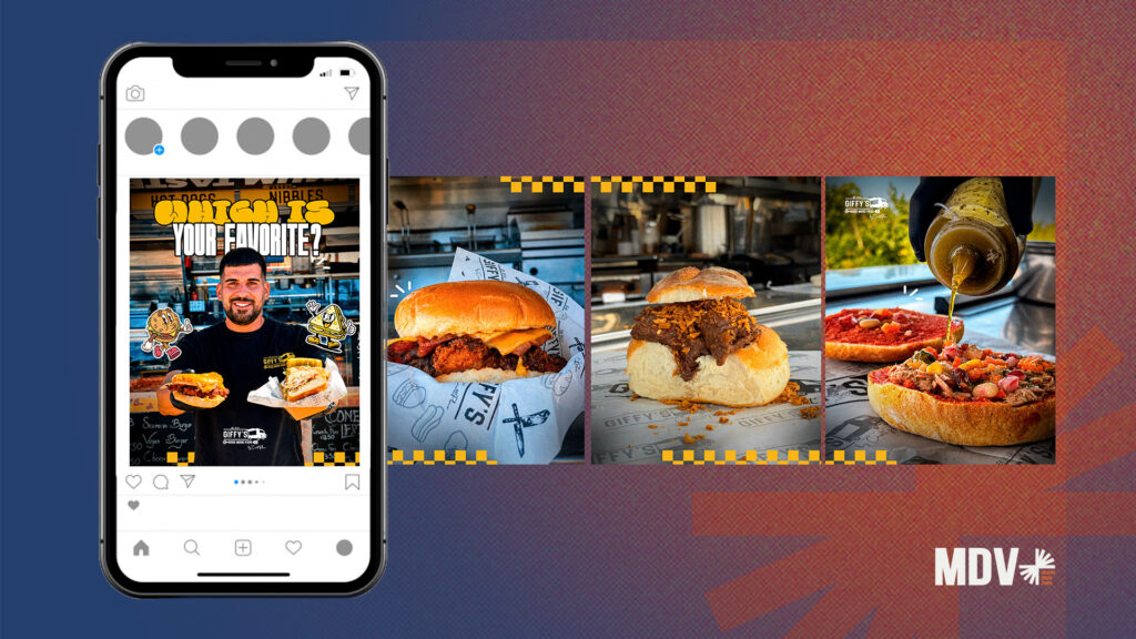
Carousel ads let people swipe through multiple images or videos, each with its own headline and link. That extra space is useful when one image genuinely isn’t enough to make your point.
It works well when:
- You’re showing a range of products rather than one item
- You want to walk through steps, features, or before-and-afters
- You’re telling a small story rather than making a single pitch
- You want to test several creatives at once within one ad
Carousels tend to underperform when the cards feel disconnected or thrown together. Consistency across the cards, in tone, colour, and layout, matters more than people expect, which is really a design problem as much as an advertising one. It’s the same principle we cover in how graphic design shapes your social media presence: the individual pieces need to feel like they belong together.
Collection Ads: Built for Browsing and Discovery
Collection ads combine a cover image or video with a set of products displayed underneath, all within an immersive, catalogue-style experience. When someone taps it, they land in a full-screen, app-like browsing view without leaving Facebook or Instagram.
It works well when:
- You have a genuine product catalogue, not just one or two items
- You want people to browse rather than land on a single decision
- Mobile is your main audience, since this format is built for that experience
- You’re running ecommerce and want a shortcut to a store-like feel
Collection ads lean heavily on visual quality, since browsing is the whole point. A strong cover video or image matters here more than in almost any other format, which is where professionally made videos tend to earn their cost back rather than being a nice-to-have.
Matching the Format to Your Goal, Not Just Your Product
Format choice isn’t only about what you’re selling. It also depends on what you actually want the ad to do.
- Awareness or first impressions: Single image ads keep the message clean and easy to process quickly.
- Consideration, comparing options: Carousels give people room to explore variety before deciding.
- Purchase intent, ecommerce browsing: Collection ads mimic a shopping experience and reduce the steps between seeing and buying.
This is the same logic that applies when choosing between Google Ads campaign types: the format or campaign type should follow the objective, not the other way around.
Don’t Ignore the Mobile View
Most of the audience seeing these ads is on a phone, not a desktop. A carousel that looks great on a laptop screen can feel cramped on mobile, and a collection ad’s browsing experience only works if it loads fast and feels smooth on a small screen.
Before launching anything, it’s worth previewing exactly how the ad behaves on mobile, since that’s where most of your traffic and attention actually lives, regardless of which format you pick.
Testing Formats Instead of Guessing
If you’re not sure which format fits, the answer is usually to test rather than debate it internally. Run a single image and a carousel against the same audience with the same offer, and let the results decide.
A few things worth tracking:
- Cost per click and cost per result, not just impressions
- How far people scroll or swipe in carousel and collection formats
- Whether one format consistently outperforms across different offers
- How results shift as Meta’s own ad delivery systems evolve, since changes like Andromeda affect how creative and format get prioritised behind the scenes
Testing takes a bit more setup upfront, but it removes the guesswork that leads most businesses to just reuse the same format out of habit.
Building This Into a Proper Ad Framework
Format is one decision inside a much bigger process, targeting, budget, creative, and testing all matter just as much. If you’re setting up campaigns from scratch, our step-by-step framework for modern Facebook ads creation walks through how format fits into that wider structure rather than treating it as an isolated choice.
There’s No Single Best Format, Only the Best Fit
Single image, carousel, and collection all do different jobs. Single image keeps things simple and fast. Carousel gives you room to show range or tell a story. Collection turns your ad into a browsing experience built for mobile shopping.
The businesses that get the most out of Facebook ads aren’t the ones using the flashiest format. They’re the ones matching the format to the goal, testing instead of guessing, and putting real effort into the creative behind it.
If you’re not sure which format fits your next campaign, that’s exactly the kind of decision the team at MDV works through with clients before a single ad goes live.
FAQs About Facebook Ad Formats
There’s no universal answer. Single image ads often perform well for direct offers, while collection ads tend to convert better for ecommerce browsing. Testing against your specific audience is the only reliable way to know.
Not automatically. Carousels work better when you have multiple products or a story to tell. For a single, clear offer, a single image often performs just as well with less effort.
They’re built with ecommerce in mind, since they mimic a shopping experience, but any business with a genuine product range can use them effectively.
There’s no fixed number, but consistency matters more than quantity. A handful of well-designed cards usually outperforms a long, disjointed sequence.
Yes, where budget allows. Running the same offer across formats gives you real performance data instead of relying on assumptions.